How We Renovated Our User Interface Design and Learned a Few New Tricks.
Over the last few years, consumer devices and computer systems have undergone a change in design direction and a new style has emerged. Touch screens, high resolution displays and gesture control have all contributed to enhancements in visual design that lead to a better ergonomic experience for users.
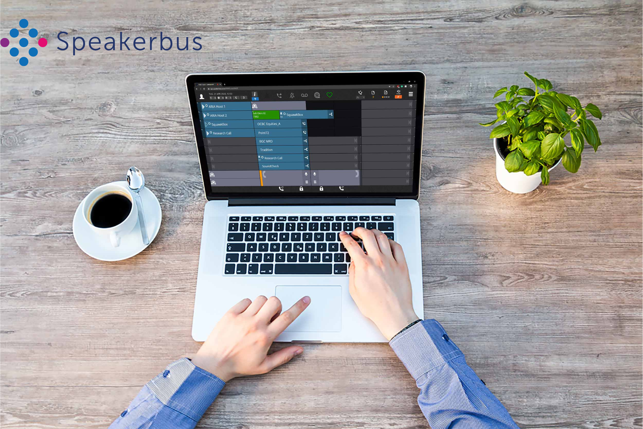
When we looked to unify the user experience across all iSeries devices and software the opportunity arose to define a new visual style. This is the story of our user experience refresh project - SLATEUX.
Why?
In 2011 we were developing the iD712 Intercom software as a next generation endpoint product for the initial release of iManager Communications Server. As we created the usual wireframe sketches and concepts we started to notice some of our stock icons and styles were starting to feel a little dated. Not wanting to bake in a user interface style we were not happy with into a new set of products we decided to do something completely different.
A Design Philosophy, Not Just a Design…
Importantly for the Product Group, SLATEUX would not be just one endpoint update but an overarching interface design to be implemented across the whole product range. The SLATEUX project team created a set of rules and objectives to guide the overall development.
- Simplified graphics to reduce visual workload for users.
- Easy to read fonts and textual areas to reduce eye strain.
- Use white space to provide separation without clutter
- Plain colours only and no gradients
- Show the same features in the same way on every device
- No reliance on colours to show activity
- Scalable (vector design)
We then set about enumerating the quantity of work and right away realised we had taken on quite a significant task!
Why Use One Designer When You Can Have Fifty!
The SLATEUX project team needed to use an external designer to provide them with a consistent style which the in-house team could develop and move forward. Knowing from past experience that this would be an evolution and continued development would be required we required a kick start and not a perpetual external relationship.
“…We soaked up the design concepts from the whole globe including UK, USA, India and China - with every designer competing to get our business.”
Paul Kitchener, Marketing Communications Manager
Paul Kitchener, Marketing Communication Manager proposed that we should use a new way to pick the creative minds of the global design community. Using a crowdsourcing technique to obtain proposals from designers around the world meant they were not restricted to the ideas and style of a single company or designer. Paul said “With a design brief uploaded to the graphic marketplace we soaked up the design concepts from the whole globe including UK, USA, India and China – with every designer competing to get our business.” The project team selected the best design which the in-house designer used as a reference concept to create the icons and the other elements of the interfaces.
Skeuomorphic Rethink…
One key element of SLATEUX was the removal of icons that resemble their more physical counterparts or functions. An icon that resembles a real world equivalent is skeuomorph and they can be very useful when building systems for people who do not frequently interact with the interface. The downside of skeuomorphism is that you are trying to pack in lots of detail that adds significantly to the visual processing of the user that can lead to eyestrain and tiredness. As soon as the user is familiar with the function of an icon the benefits of skeuomorphism are diminished.
For SLATEUX all icons were reimagined and redrawn, simplifying the designs to reduce visual overload and implement a consistent style. A key rule throughout the project was to make sure that icons and features were easy to differentiate and for users to quickly assimilate information from their devices.
“Our users work in a high paced, high pressure environment and their tools must allow them to make decisions rapidly and without hesitation.”
Charles Miscampbell, VP of Marketing
“We took this aspect of the refresh really very seriously,” said Charles Miscampbell VP of Marketing. Charles continued, “Our users work in a high paced, high pressure environment and their tools must allow them to act rapidly and without hesitation.” With this in mind, the SLATEUX team ensured changes in device states do not just rely on colour changes, but rather the icons change when something occurs. The new icons provide positive feedback to the user and mitigate any limitations for users with colour vision deficiency.
We achieved this by changing the representations and removing gradient effects, drop shadows and using a single colour. The resulting suite of icons were more recognisable at a glance, had a consistent style and most importantly were much more understandable to both old and new users.
SLATEUX prioritises purpose and our team put themselves in the user’s chair, visualising the key functions amongst all the other activity on their devices on a typical users’ day. By removing the clutter the resulting cleaner, simple interfaces empowered users to find, react and access information much more efficiently.
TaDa
With the launch of Windows 8, new Xbox Dashboards & Windows Phone, Microsoft delivered a huge change in consumer friendly; simplified UX with bold and vibrant colours. Apple joined this trend with the release of new simplified icons for iOS 7. The wholesale shift in design style showed how the market is essentially conformist and graphical style changes like fashion. This fresh, modern style was also being embraced by web designers at leading sites like the BBC and Google.
The new design has been inspired by the market shift away from complex interfaces towards a user experience that puts significant emphasis on clean simple graphics.
Fun with Fonts
The team understood from user feedback that the original font and its spacing could be improved this was further highlighted as the refresh progressed and the simplified interfaces began to appear. We briefed the software development team on their conclusions. Running with the request they produced a selection of new styles and options. Each style was assessed for readability and clarity before selecting the new style. The final font scheme now allows the user to add more text to each key, whilst the new high contrast white text colour makes every line stand out.
Vibrant New Colours
More colours – we managed to increase the number of colour styles available and introduce a vibrant contrasting colour palette. The team kept a key selection of colours matching the old palette so users migrating to SLATEUX would retain most of their layout styles. The increased range of the colour palette offers the users more ability to highlight different features at the device.
Single Colour - With SLATEUX the elements were striped back to the essentials using single-colour; simplified icons. The original interface presented a busy graphical environment with multiple colours, gradients, bevels and drop shadows that were becoming a distraction and beginning to show their age.
Consistency for User Familiarity
Another aim realised with SLATEUX was to rollout a consistent experience across a whole range of devices. Deploying SLATEUX icons for the same features across different iSeries devices. In essence the team wanted an iTurret user to free seat to a SE 708 speaker and be immediately productive, having already experienced the interface on their iTurret. With SLATEUX this was achieved by incorporating the new designs into all product development concurrently so that the new user interface could be released across the range within 6 months.
Why Call It SLATEUX?
SLATEUX is a Speakerbus brand name given to the new User Experience (UX) graphical elements and design style used on iSeries devices. Charles Miscampbell (VP Marketing) says: “We realised that working across multiple devices with something as significant as a new user interface design needed a focus point. It was becoming a chore describing the work as ‘the new interface on version x’ so we created a brand for the design. When we looked at our work we saw that everything was flat, smooth and consistent in colour, SLATE was chosen as a good description.”
Team and Market Feedback
Regular reviews were held throughout the project with users and customer facing teams making certain the final product would meet both our and their expectations.
This collaborative approach ensured that feedback was incorporated immediately and allowed the project team to hit key project and software build dates.
“SLATEUX provides a much cleaner and focused User Experience.”
John Graves, Product Manager
SLATEUX user trials throughout the project uncovered strong demand for the new look with Speakerbus’ staff chasing the project team to upgrade their personal iTurrets to SLATEUX. Work with users showed that the new visuals reduced eye strain over the working day. Project team member and Product Manager, John Graves, guided the SLATEUX development from design through to testing with our end user community. John said, “SLATEUX provides a much cleaner and focused User Experience helping our user community quickly identify activity on our devices.”
“It was like seeing the product in a whole new light.”
Matthew Cheatle, Product Coordinator
Team members were genuinely proud to see the change rollout and felt like the hardware had been upgraded not just the UX. Matthew Cheatle, Product Coordinator said, “It was like seeing the product in a whole new light.”
Customers who tried the new UX during beta trials felt like they had a new turret/dealerboard with the dramatic change in icons, fonts and colours and the general feedback was very positive. Some beta clients were so happy with the elegant new look of the UX they demanded the update straight away.